Embracing Empathy - AngelHosts Introduction
The cover slide serves as a poignant introduction to the AngelHosts presentation, featuring a high-impact photograph that sets a compassionate tone. The image choice excellently conveys the human aspect of the service, with a close-up of a child being embraced, suggesting care and support. The overlaying title "ANGELHOSTS" in bold, white sans-serif font is striking and easy to read, while the subtitle "Investor Presentation - November 2017" is appropriately placed at the bottom, maintaining a professional and informative atmosphere. The image is emotionally engaging, which is effective for drawing in a millennial audience who values social responsibility.

Addressing Displacement - The Housing Challenge
This slide effectively outlines the core problem that AngelHosts aims to address. The use of bold, capitalized headers draws attention to the key points, and the textual content is concise yet informative, making it easily digestible for the audience. The left-aligned text structure maintains a clean look, and the image on the left provides a visual connection to the issue of displacement. However, the white text on the lighter parts of the image could benefit from a drop shadow or background to enhance readability.

Building Safety and Community - AngelHosts' Strategy
Slide 3 presents the proposed solutions with clarity and a structured layout. The use of icons next to each solution offers a visual anchor, making the information more memorable. The inclusion of a high-quality image of a bag by the door symbolizes readiness and departure, which complements the theme of temporary housing. The solutions provided are relevant and practical, appealing to an audience interested in actionable steps. The design is consistent with the previous slide, maintaining coherence throughout the presentation.

Sustainable Support - The Financial Framework
This slide outlines the business model with a focus on revenue streams, which is key for an investor presentation. The use of different text boxes for each revenue source is an effective way to segment information. The design is minimalistic, ensuring attention is not diverted from the content. However, there might be a missed opportunity to include a visual element that relates to the financial aspect, such as a simple graphic or icon, which could make the slide more engaging.

Strategic Positioning in the Market
This slide successfully breaks down the competition and AngelHosts' unique value proposition. The use of well-known logos helps to immediately convey the competitors and differentiates AngelHosts' approach. The concise bullet points underneath each competitor provide clear, direct comparisons. The design is straightforward, making good use of space and hierarchy to guide the viewer's eye through the content in a logical manner.

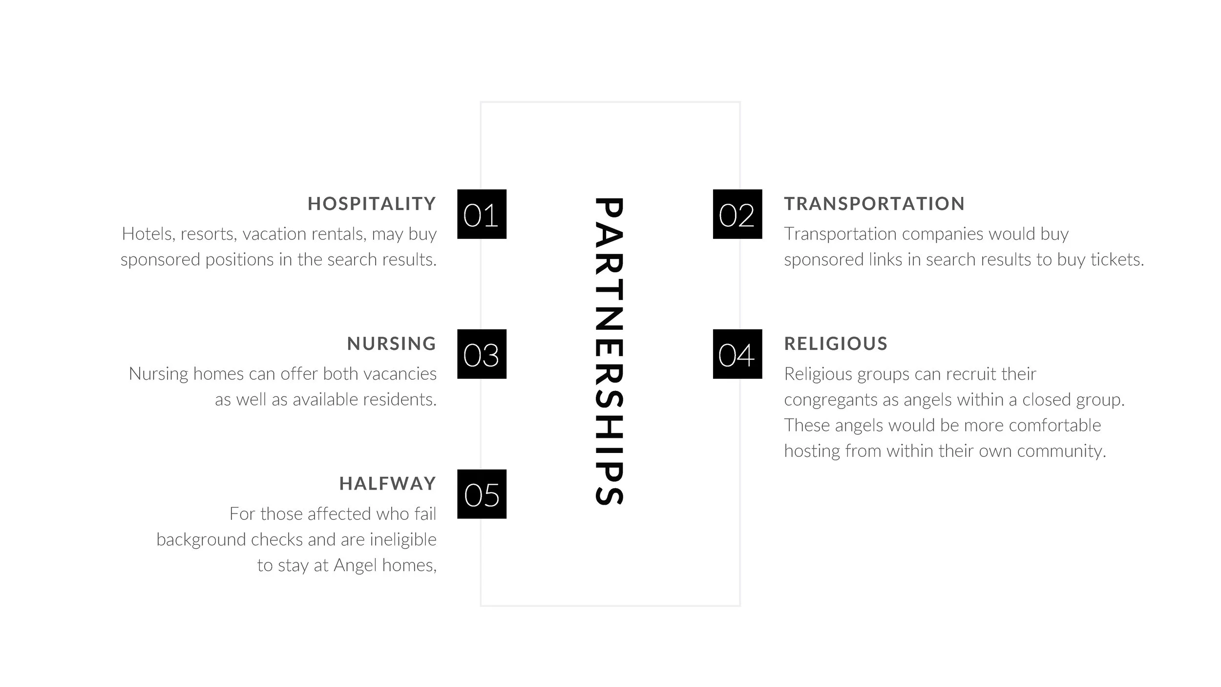
Expanding Reach Through Partnerships
Slide 6 effectively identifies potential partnership categories, which are critical to the scaling strategy of AngelHosts. The numbered approach aids in organizing the content, and the balanced layout makes the slide appear ordered and accessible. The use of icons could enhance the visual appeal and immediate recognition of each category. The slide’s content is relevant and shows strategic thinking, likely resonating with a forward-thinking millennial audience.

Milestones to Launch - A Timely Journey
The timeline slide provides a clear visual representation of the project's progression, which is essential for investors to understand the development phase. The timeline is laid out horizontally with distinct icons, making it intuitive to follow. The milestones are well-spaced and clearly marked, although the contrast between the text and background could be increased for better readability. The choice to use a photo background may distract from the timeline itself; a simpler background might enhance focus on the content.

Forecasting Success - Financial Trajectory
The financial projections slide is crucial in any investor presentation. This slide employs a bar graph to depict sales and net profit, providing a visual and straightforward depiction of financial growth over time. The choice of contrasting colors for sales and net profit is effective, although a key or legend would be helpful for first-time viewers to understand the graph quickly. The accompanying explanatory text is succinct and adds necessary context to the data presented.


